Visual regression testing for design systems with Figma branches
A guide for using Figma branches to improve the reliability of UI components.
I believe that reliability is one of the most important aspects of successful design systems. Not just in code, in Figma too. Many designers rely on our work every day. And we, design systems maintainers, should be sure that we’re not introducing unwanted breaking changes to their designs.
Not gonna lie – I have always bit envied frontend developers all their existing tooling to make UI components more reliable. That’s what testing is for and especially visual regression testing (VRT). For me, VRT is one of the most important tools to release updates with higher confidence that things won’t break with new updates.
Developers have a few tools that they can use for visual testing. As designers, we were able to find some workarounds for it in Figma too, but it was just it – a workaround that required a lot of manual work. That luckily changes with Figma branches, recently introduced feature that heavily improved our contribution and testing workflows and processes.
Let me show you how on the example of a button component.
Now, we want to make some changes to it.
The first step: Using a branch for changes
Our contribution guide now strongly recommends using branches for visual, structure, and/or potentially breaking changes in our components, instead of making changes directly in the main file.
It may feel like it's adding some complexity to the contribution process. It may be true too. But it's also a small price to pay for all the benefits that come up with using branches for changes in a design system.
Next: Design changes
For the purpose of this article, I changed the background color and focus states of our button. But it can be anything, depending on what you need to do.
Once we have made all the changes, we can request a review or do it ourselves.
New step: Reviewing changes
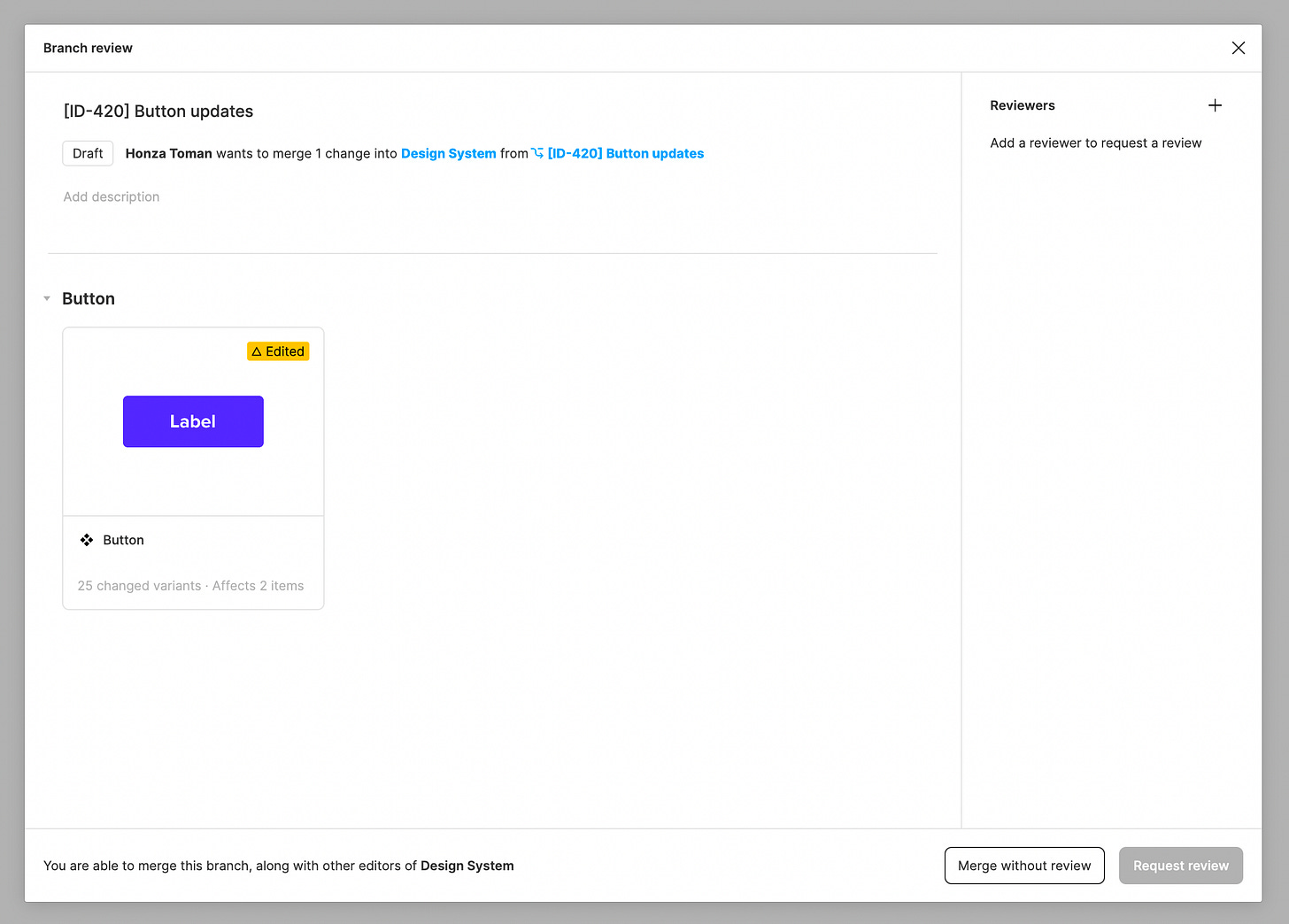
Reviewing changes is something that is a necessary step before merging changes back into the main file. For that, Figma offers a Branch review dialog listing all the changes that were made in the branch.
Having a visual overview of what changed and being able to compare Before with After are two key benefits we get from working on a branch. So after opening a Branch review dialog, we can see that there are 25 changes in our Button component.
When we go to the component detail, we can see which variants were edited and what's their latest design.
One more level deeper, and we can compare the Before and After versions of each variant. It may not look that important with this simple change, but it's a great tool to spot changes that were not intentional.
Visual difference tool is your new best friend in situations where you want to know why some component changed and compare it to its previous version. This is something that just isn’t possible without working inside the branch.
This process may be time-consuming though, especially with large component sets with a lot of variants. I once reviewed 50+ changed components one by one, and I don’t want to do it ever again. So I started to think about how to make component testing easier (and faster).
Test scenarios to the rescue
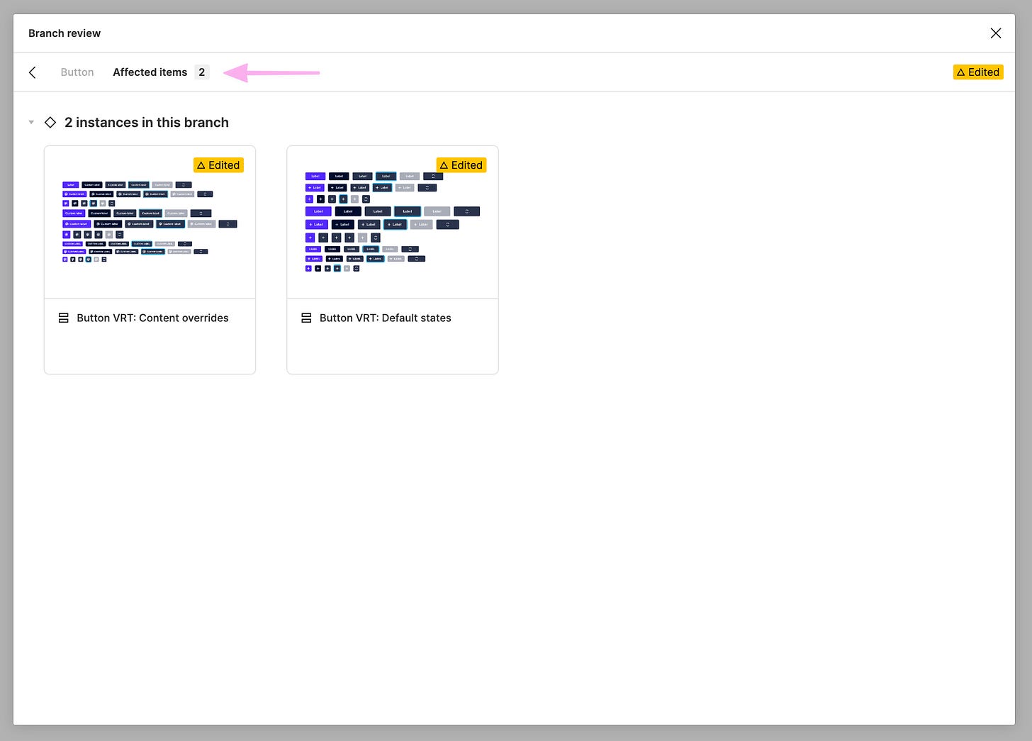
There is one more important feature of Figma branches that you could spot on images above – Affected items. I realized that this can be also used for visual regression test scenarios (similarly as developers have for components in code).
The number and types of test scenarios vary from component to component, but I usually have at least two sets of VRT (visual regression testing) scenarios:
Default states scenario
Content overrides scenario
A deeper dive into visual test scenarios
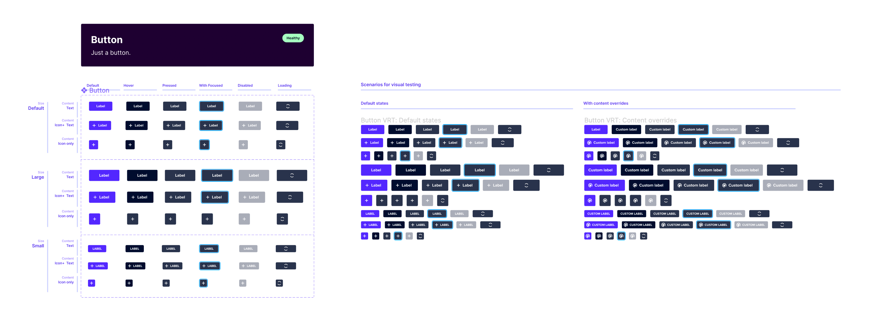
VRT scenarios are nothing else than instances of all variants from the component, wrapped into a frame with an auto-layout applied.
Thanks to this simple setup, Figma will display the affected items as a big group instead of many separated variants. As you can imagine, it's way easier to spot all differences in this setup (I’ll show you later).
Here is a preview of how it looks on the canvas for our Button component. We’re usually placing test scenarios next to the main component definition.
Default states test scenario
Default states scenario is useful mostly for spotting visual breaking changes (change of sizes, colors, paddings, ...) and for checking that everything looks as expected. It's also great if you decide to change default values e.g. for a label or an icon. Note that changing default values can be also a breaking change for prototypes using this component. Designers who created them can e.g. rely on the default icon and suddenly it changed to something else which can break their prototype flow.
As you can see on the gif below, when you open diff for Default states scenario, it gives you options Side by side and Overlay. While Side by side offers a more detailed view of all changes, I find the Overlay way more useful. Especially because it offers me bigger previews and it's hard to spot differences in Side by Side view with this small preview area.
As mentioned already, the Overlay mode is critically important for our review process. As a reviewer, I can play with the overlay slider on the bottom to adjust the transparency of the layers to see what is changing and whatnot. This helps to spot differences more easily.
Note: I believe that Default states test scenario could be covered natively by Figma easily by showing a parent component set frame. If (or when?) Figma introduces this natively, there won't be a reason to manually create and maintain Default states test scenario.
Content overrides test scenario
If the Default state test scenario is important for spotting visual breaking changes, Content overrides scenario is critical for very different reasons. One of the most common breaking changes in Figma is resetting component overrides. What does it mean? Imagine that a designer used our Button, and they changed its label to "Create" and icon to some custom one too. And if these content overrides are reset when the library is updated, the system is not as reliable for its users as it should be.
Content overrides test scenario helps us to identify unwanted breaking changes, e.g. when we play around with a component and we accidentally remove or replace something.
How to set up this test scenario? First, we identify overrides we want to support for each component, and we add them to this test scenario. For our button, it's only an icon and label. So we changed these two layers to some custom values.
Let's see how Overlay mode looks like for our Content overrides test scenario. To illustrate it better, I made an intentional breaking change with Label to see the effect on the test scenario.
You can clearly see that something is different on the first row of buttons. If we play with the transparency, we quickly see that the label override for the first button in the row has been reset to the default value. Merging this would cause a breaking change for everyone who uses our button and all their custom labels would be replaced by a default “Label”. This test scenario helps us to spot (and fix) it in advance.
Important note
Test scenario frame(s) with all instances needs to be created before the branch is created! If a test scenario is created on the branch and was not yet existing in the main file too, Figma won't have a Before state to compare to.
The good practice is to create all test scenarios in the main file when you know you're gonna touch the component and create a branch for changing components only after that.
What could be some other test scenarios to support?
We're in the early phase of our visual regression testing in Figma, so we started with small. But there are more things that could be tested, especially for more complex components (that may or may not rely on auto layout).
Some possible test scenarios for inspiration:
Resizing to test different constraints or auto layout behavior (e.g. card component resizing).
Key component use cases and compositions (e.g. buttons in the header or in button group).
Parity with related components (e.g. TextInput is aligned next to a Button to test that their height always matches).
It may be sometimes hard to figure out which are the best scenarios to support. I have a nice rule of thumb for it. When a designer reports some problem with a component we provided, I try to create a test scenario covering it so it won’t happen again. With this approach and over a period of time, the stability and robustness of the set of user interfaces in Figma improve organically.
That's it branches and visual regression testing in Figma. I hope it was somehow useful and you now understand better how Figma branches can help in making design system’s components more reliable.
If you have any feedback or questions on the post, feel free to comment or reach out to me on Twitter to discuss them more.


Do you know of any plugin out there that would allow you test the text layer override of multiple components at the same time to see if there are any breakages in the text layer override. this would be a very useful test.